

Stage 1 - Research and Planning
Web 2.0
Over recent years, there has been a significant proliferation of the Internet which means that today there are millions of interconnected networks which can be accessed by billions of people all over the world. Furthermore, the speed at which we can access this information is extremely quick and instant. We have made full use of the Internet in the research and planning stage of our project.
 |
| This video has cool editing effects that influenced our video |
Youtube - This was extremely useful in the early stages of the project as is the biggest platform for music videos in the world. Therefore, it was a key site to draw inspiration from for our video. By looking at other existing videos, we were able to see the conventions of music videos and get a better idea about what we could do for our video. For instance, we really liked certain effects in Calvin Harris' "How Deep is Your Love" and this became an influential to our video. Furthermore, the range and availability on YouTube is so vast, meaning we could look at such a variety of videos which was useful as we could look through at the genres that we were interested in, or the videos of any artist tha we liked. Finally, this website was extremely useful for uploading videos to, via the media department's YouTube channel. For example, we could upload our steal-o.
 |
| Beyonce's videos were inspirational in terms of her performance/choreography |
 |
| We didn't just look at music videos, we also looked at dance videos to get ideas for our routine |
 |
| Google Images |
Google Images - This site was extremely useful for researching different styles and looks for our band. There are so many images available of artists and clothing which was really useful as a point of visual reference for D4MES' styles. It was also useful for when we were planning our promo shots, as we could look at how other girl bands were positioned.
 |
| Fifth Harmony had various promo shots that we could reference |
 |
| Rita Ora was one of the inspirations for my outfit |
Blogger - Blogger has been a very useful way to document all our research and present it in a coherent way. Furthermore, in terms of the group, it meant we could each express our own opinions and personal influences, as we do not all like the same thing. So having our own blog meant that we could both have our own ideas and express the preferences of the group as a whole.
 |
| Gift and I had very different initial ideas and influences |
Mobile Technology
Portable devices nowadays are extremely convenient and often technologically converged meaning we can use them to perform a range of tasks. For instance, we can use mobile phones to take picture, watch TV, navigate around the world and this is all in addition to communicating. The ability to communicate and take photos via mobile technology was very important for us.
 |
| We used it to plan/organise things |
Whatsapp - Whatsapp was extremely useful for the group and became our main platform for communicating. We were able to instantly send and receive messages, as well as send media such as photos and videos, Communicating in this way meant that we could both organise ourselves and help one another out.
 |
| Our Whatsapp group chat |
 |
| We sent numerous pictures/images |
Taking photos - Throughout the research and planning stage, we would each constantly take photos in order to document the process and as a way of providing evidence, which we knew would come in handy later on in the project. We could then send this to other members of our group via Whatsapp or email it to ourselves to use on our blogs.
 |
| I took many pictures during this stage of the project |
Stage 2 - Construction
Hardware
This was what we mainly used in the production side of the construction stage. The hardware that we used was central to our project as it enabled us to get the set and footage that we wanted.
 Canon 5D Mark II - This was the camera that we used to film our music video.We only filmed in the studio which already made the task of using the camera easier. We were able to use the camera at different angles and in different positions thanks to the tripod and dolly. However, because it was light we were also able to hand hold the camera or use a shoulder strap. We also loved how amazing the quality of the camera was - 1080p HD, and an even better bonus was being able to enhance the more prominent lighting shots by changing the lens. We were also able to manually adjust the white balance and ISO functions as we shot the footage, ensuring that each shot looked the best it could.
The main issue that we had with the camera was the problems with the auto focus, it would sometimes not work. Also, with the lens that improved the lighting for set ups such as the laser backdrop, the auto focus was not an option and so it was very difficult to keep it in focus all the way through the take.
Lighting Desk - The lighting desk was crucial to our music video as it controlled the Arri 1000k lights which subsequently gave us the range of rich colours needed to connote of themes of love, lust and desire and make our video look fun, professional and appealing to our audiences. At first we all found the system complex to use, even after a demonstration by our technician. However, the more we practiced, the easier and quickert it got and the more confident we became. The most useful feature was definitely the memory log which enabled us to save our various lighting set ups and therefore get them up instantly for filming.
 |
| My group at work at the lighting desk |
The main disadvantage of using the lighting desk was the fact that it was often very time consuming as it had to be done in order for us to shoot. Also sometimes we could not use the lighting desk unless there were two other people there e.g. one person to stand behind the camera, one person to stand in front of the camera and one person operating the desk. This is because sometimes we would have to adjust the lighting according to how it looked on the camera.
Software
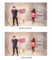 I really enjoyed exploring the various effects available and I learned a great deal about selecting the best effect for a particular shot and how to make an effect look as cool as possible when it was applied to the clip. Grading was another key feature of the software that we used for our project. The tools we used were ProCamp and Three Way Colour Corrector. Grading enabled us to make D4MES and the video as a whole as good as possible and it was particularly important for enriching the various colours used and making the images more dynamic, consequently giving audiences a visual spectacle. It was important as the video needed to have a consistent and professional look throughout. I felt very confident while grading as I had done it in previous media projects where it had proved to be one of my strengths. However, the process was slightly longer this time round as the various set ups and backdrops used for our video meant that we could not copy and paste the same setting in every clip. Ultimately, we had to adjust each clip individually, which was time consuming, however, the end result meant that the effort paid off.
This is what we used in the post production stage. The various software was instrumental to our project as it allowed us to present D4MES in the best way possible by making all three products look good.
Adobe Premiere Pro - This was the software we used to edit our video and so it was extremely useful. It really helped that we'd all used the software before in previous media projects as it meant we were all confident in using it. It was very easy to use and enabled us to apply a variety of effects to our video and thus make it more engaging for our audience. The fact that we could have multiple track layers was perhaps the most useful feature of the program as it meant that we could comfortably make as many adjustments as we wanted.
 |
| Multi track layer format |
 I really enjoyed exploring the various effects available and I learned a great deal about selecting the best effect for a particular shot and how to make an effect look as cool as possible when it was applied to the clip. Grading was another key feature of the software that we used for our project. The tools we used were ProCamp and Three Way Colour Corrector. Grading enabled us to make D4MES and the video as a whole as good as possible and it was particularly important for enriching the various colours used and making the images more dynamic, consequently giving audiences a visual spectacle. It was important as the video needed to have a consistent and professional look throughout. I felt very confident while grading as I had done it in previous media projects where it had proved to be one of my strengths. However, the process was slightly longer this time round as the various set ups and backdrops used for our video meant that we could not copy and paste the same setting in every clip. Ultimately, we had to adjust each clip individually, which was time consuming, however, the end result meant that the effort paid off.
 |
| Rendering files |
The main disadvantage we found with using Premiere Pro was the rendering process. In order to view any effect on our footage in real time, it meant that we had to render it first. Considering we used so many effects, this occurred quite frequently. It often took a long time and meant that we had to wait.
 |
| Photoshop toolbar |
Adobe Photoshop - This was the software that we used to create our album digipak. The other members of my group all had previous experience on this program due to having used it in projects before I had joined Latymer and therefore I was the only person without any experience. This meant that I took a step back and mainly watched the others. However, despite having no previous experience, I was able to do some things and so using Photoshop proved to be very valuable and a real learning curve. I learned many things such as how to use the paintbrush to colour in and erase an image. I also learned that retouching images was not a simple process but rather a time consuming and complex one, but it had to be done to enhance the shots of the band that went onto the website. The wide range of tools was very useful and meant that we had a lot of creative choice. However, we had an issue of the program occasionally crashing in the middle of what we were doing and there were rare occasions where work would get lost as a result.
 |
| Paintbrush tool |
Web 2.0
 |
| Different features that we could add |
Wix - This was what we used to create our website. I would say that this was the software program that I personally did the most work on and was the most responsible for and I really enjoyed using it. Arguably the greatest bonus of Wix was that we could create our website to a professional level for free. It was very easy to use and contained a wide variety of apps and features that we could add to each page and make the website as interesting as possible. It also enabled us to achieve a synergistic marketing campaign as we were able to connect the website to our various social media accounts and to YouTube. Therefore we were able to make the website the social hub. The only issue that we found with Wix was that the preview feature did not always work and so we could not always see what certain pages looked liked outside of the editor view.
 |
| D4MES' Twitter page |
Twitter - This was our main social media account that we used for D4MES. It is very useful that nowadays the technological convergence of smart phones means that sites such as Twitter can be easily accessed by anyone, anywhere in the world. Therefore, Twitter was a great way to reach out to our audiences and attract fans. Furthermore, Twitter is an example of cross media convergence - it is possible to post a range of media on one platform and thus it was possible to interact with audiences and make our profile as interesting as possible. We have posted a range of things including information about competitions and photos.
Stage 3 - Evaluation
Web 2.0
 |
| Editing a Prezi presentation |
Prezi - This enabled me to create eye-catching and visually engaging presentations. The fact that it could be embedded into my blog was very useful as it meant that the presentation could be instantly viewed. It is a fun way of reading information as you don't just have to scroll down and read paragraphs of text. I could present my work in an efficient and concise way as I was able to write in bullet points and combine it with plenty of images. Overall, the preset templates that are available on Prezi meant that I could easily and quickly present neat and engaging presentations.
 |
| How I uploaded a presentation to Slideshare |
Slideshare - This enabled me to display presentations. I was able to embed this into my blog and thus allow the information to be viewed instantly. It meant that rather than just take pictures of slides I had already created on Microsoft Powerpoint, I could incorporate the whole thing into my blog. It therefore meant that it was not necessary to scroll down to read information but conveniently flick through instead.
Make a gif - This enabled me to visually refer to my various music video influences, without always having to post up the whole video. I could pick specific parts of a video that influenced me and show that. It also enhances the visual appeal of my blog by filling it with exciting and different images.
 |
| Converting a YouTube video to gif format on makeagif.com |
 |
| Qualitative data from Survey Monkey |
Survey Monkey - This was very useful in gathering audience feedback in a clear and efficient way. It was very easy to use and extremely helpful as it meant we could create the survey, have people give their responses and have their responses summarized and presented in a clear way. For instance, we did not have to calculate how many people were male or female - Survey Monkey did this and gave us the qualitative data we needed.
Overall, new media technologies were vital in all stages of the project and helped us to carry out each task more easily and accomplish things more efficiently. The technology was not only beneficial in producing our music video but also in the planning stages which enabled us to have the necessary preparation for making the video and the evaluation stages where presentation was very important.
Overall, new media technologies were vital in all stages of the project and helped us to carry out each task more easily and accomplish things more efficiently. The technology was not only beneficial in producing our music video but also in the planning stages which enabled us to have the necessary preparation for making the video and the evaluation stages where presentation was very important.


